Space for colour
EGGER UK Design and Product Manager, Aimee Fletcher, explores the importance of colour and explains how warm, tonal schemes are influencing the future of interior design.
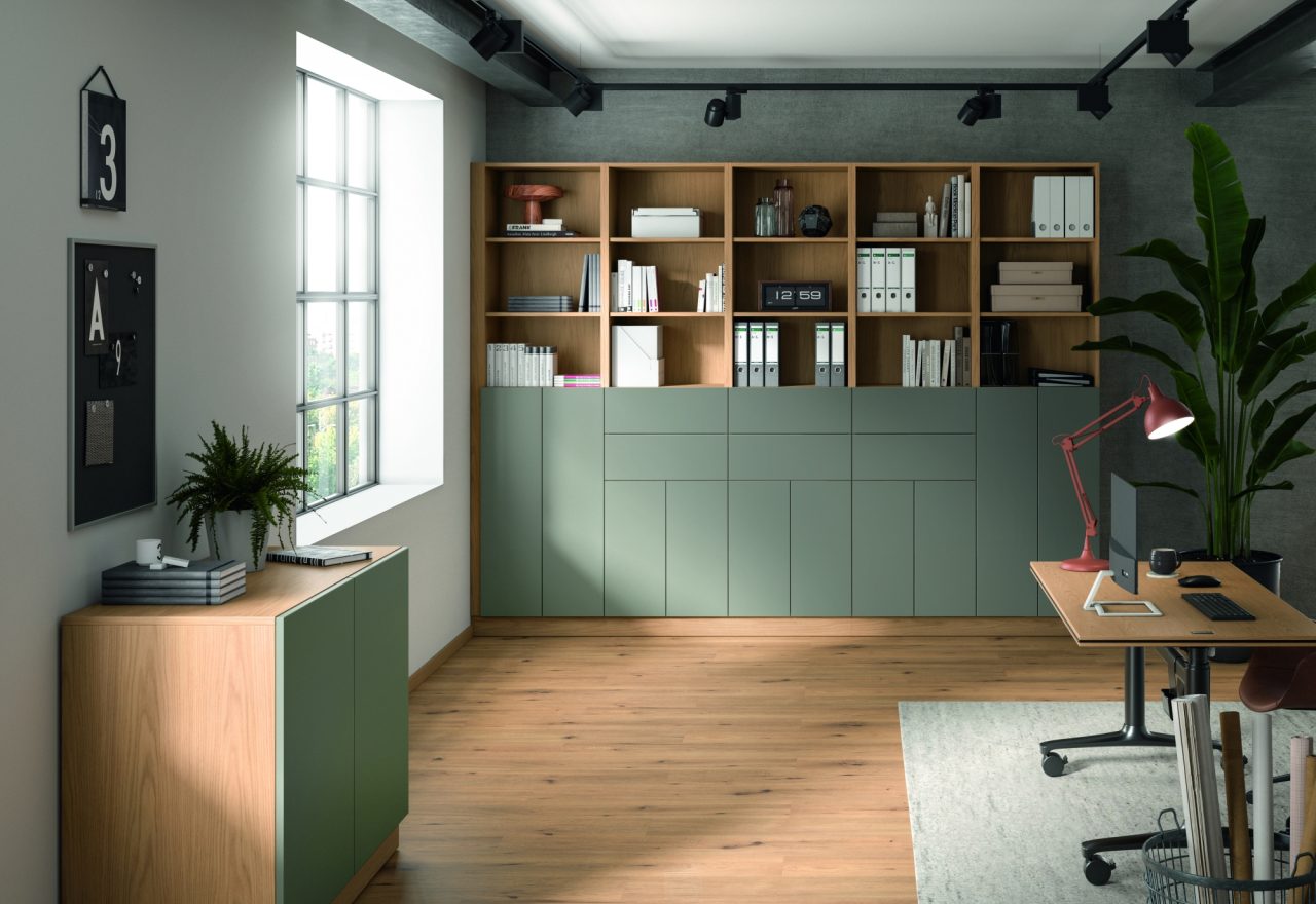
U669 ST9 Estate Green
For several years, neutral interiors have dominated the design landscape. White kitchens, cool greys and minimalist palettes have offered a sense of timelessness and simplicity. However, if this year’s Salone del Mobile in Milan demonstrated anything, it is that colour is firmly back on the agenda. Not in an overwhelming or highly decorative way, but through carefully considered schemes that create spaces which feel calm, comforting and personal.
Colour becomes the foundation
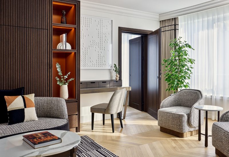
Across furniture and interior design, colour is evolving beyond an accent feature. Instead, it is becoming the foundation of a scheme. Kitchens, bathrooms and living spaces at Salone were immersed in rich, tonal palettes, with colour-drenched cabinetry, colour-matched appliances and textured surfaces combining to create environments that felt cohesive rather than contrasting. This growing preference for tonal layering represents a significant shift away from the material contrasts that have influenced design for much of the last decade.
As designers look to create spaces that support wellbeing and emotional connection, colour is being used in a more sophisticated way. Rather than relying on statement contrasts, today’s schemes are focused on harmony, depth and subtle variation.
This trend has been a key influence behind the development of the EGGER Decorative Collection 26+, where new uni colour introductions have been designed to work together while complementing natural materials such as woodgrains and stone reproductions.
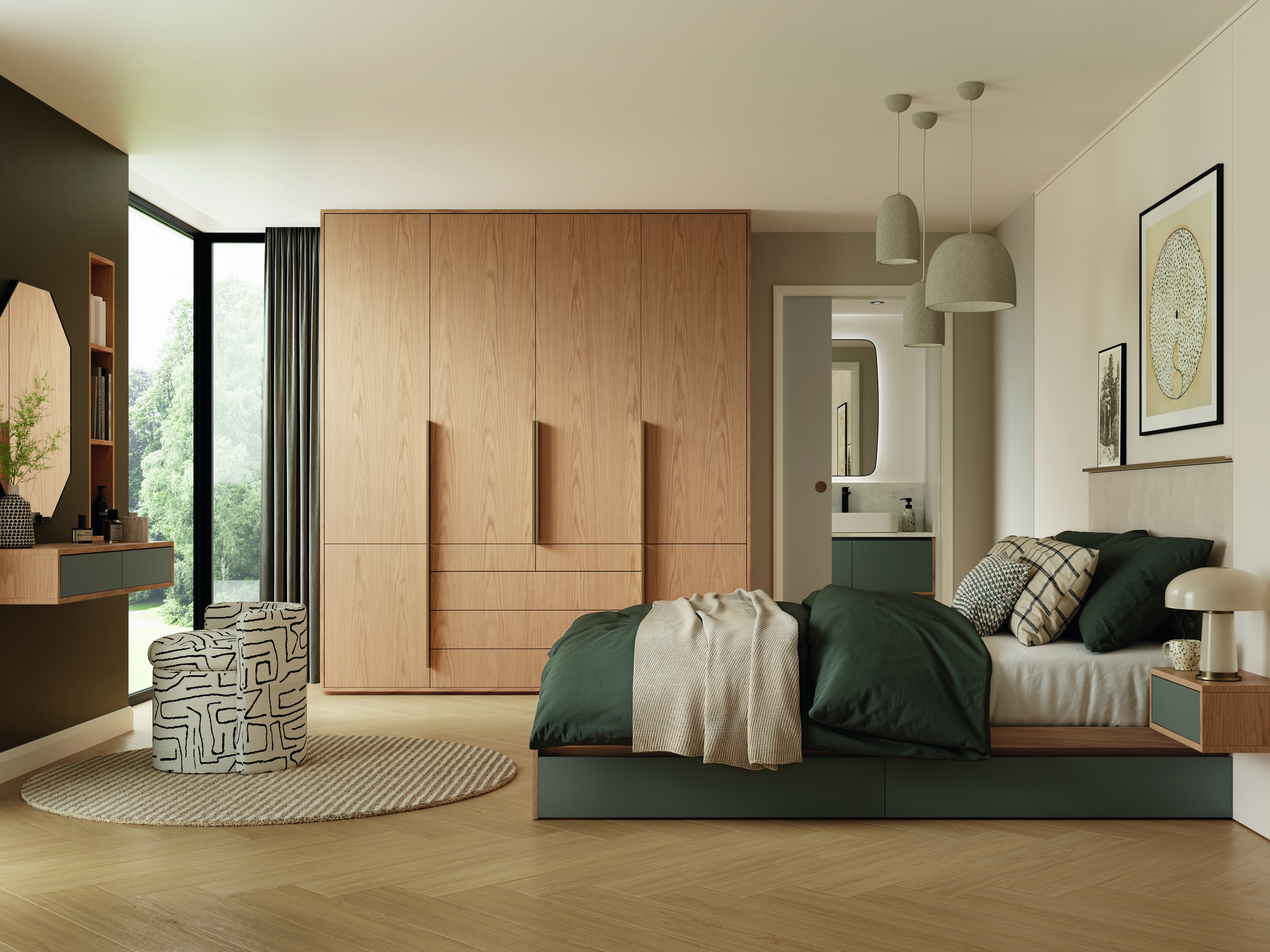
H1316 ST17 Bookmatch Oak, U669 ST9 Estate Green, U220 ST9 Soft Beige, Door Laminate U750 Taupe Grey, F661 ST76 Calcit Stone, F637 ST10 White Chromix, EL2152 Nat
The rise of warm, tonal palettes
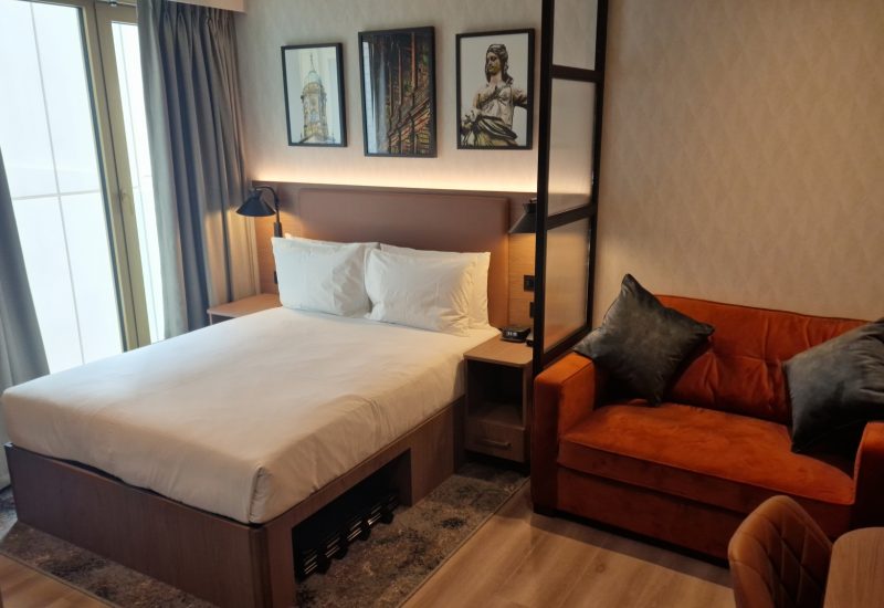
One of the biggest shifts is the move away from white as the default colour. Softer, warmer alternatives are becoming popular as they offer the same versatility. U220 ST9 Soft Beige is a prime example of this. Its warmth makes it an ideal companion to natural woodgrains and stones, while also creating monochrome schemes that feel contemporary and welcoming.
Nature-inspired colours continue to dominate interior design, and green remains one of the influential shades. Seen extensively throughout Milan, greens are evolving beyond bold statements towards softer, more refined interpretations. U669 ST9 Estate Green embodies this, offering a balance between colour and calmness. It brings a natural character to interiors while maintaining the understated elegance.
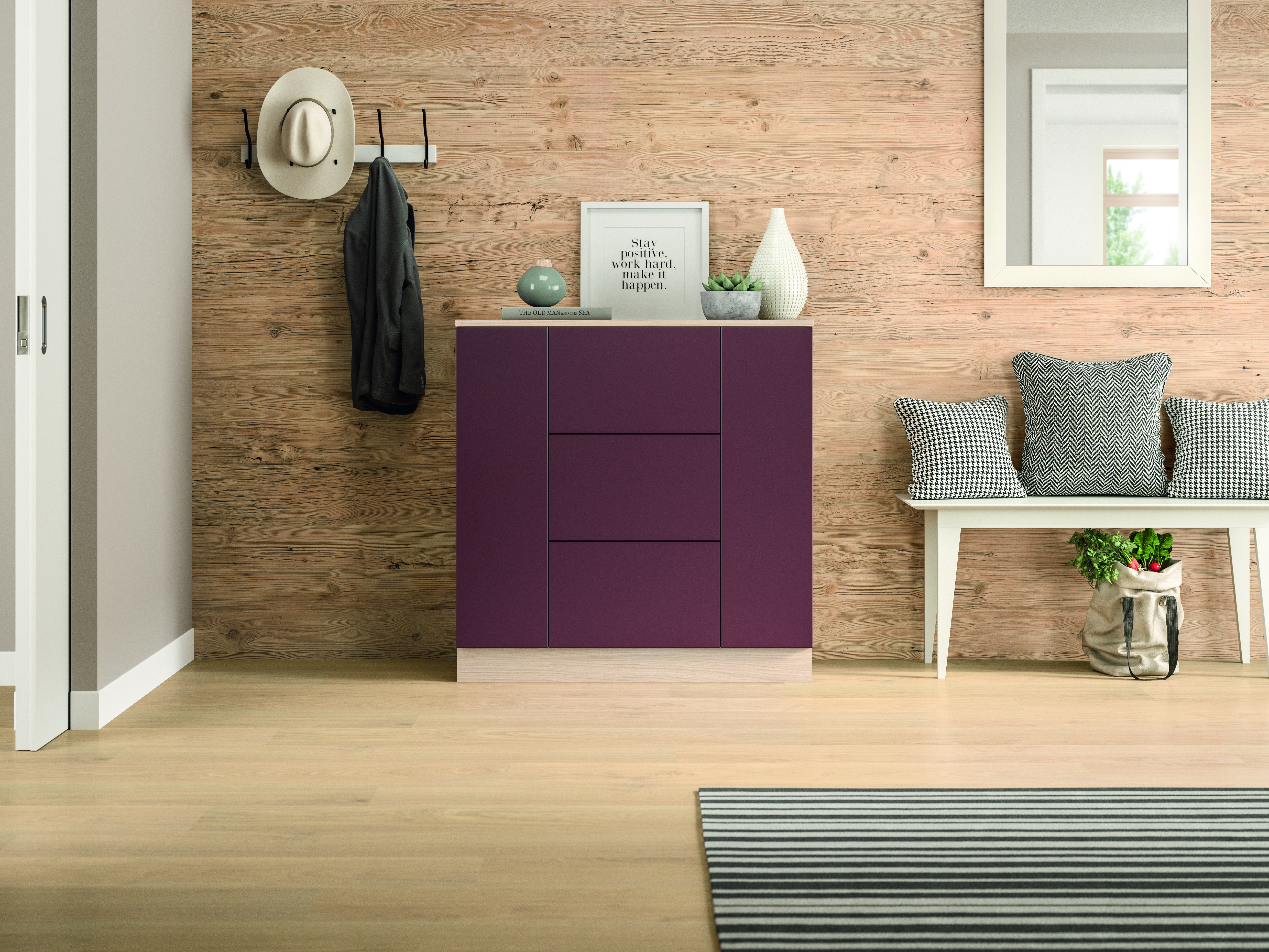
At the same time, designers are becoming more confident in introducing richer, expressive colours into everyday living spaces. U444 ST9 Cassis is an exciting addition, combining pink and purple undertones, its rich berry-inspired appearance creates warmth and sophistication without feeling overpowering.
“For those looking to make a stronger statement, darker colours are emerging. Deep, tones create a sense of luxury, particularly when paired with tactile, textured finishes”
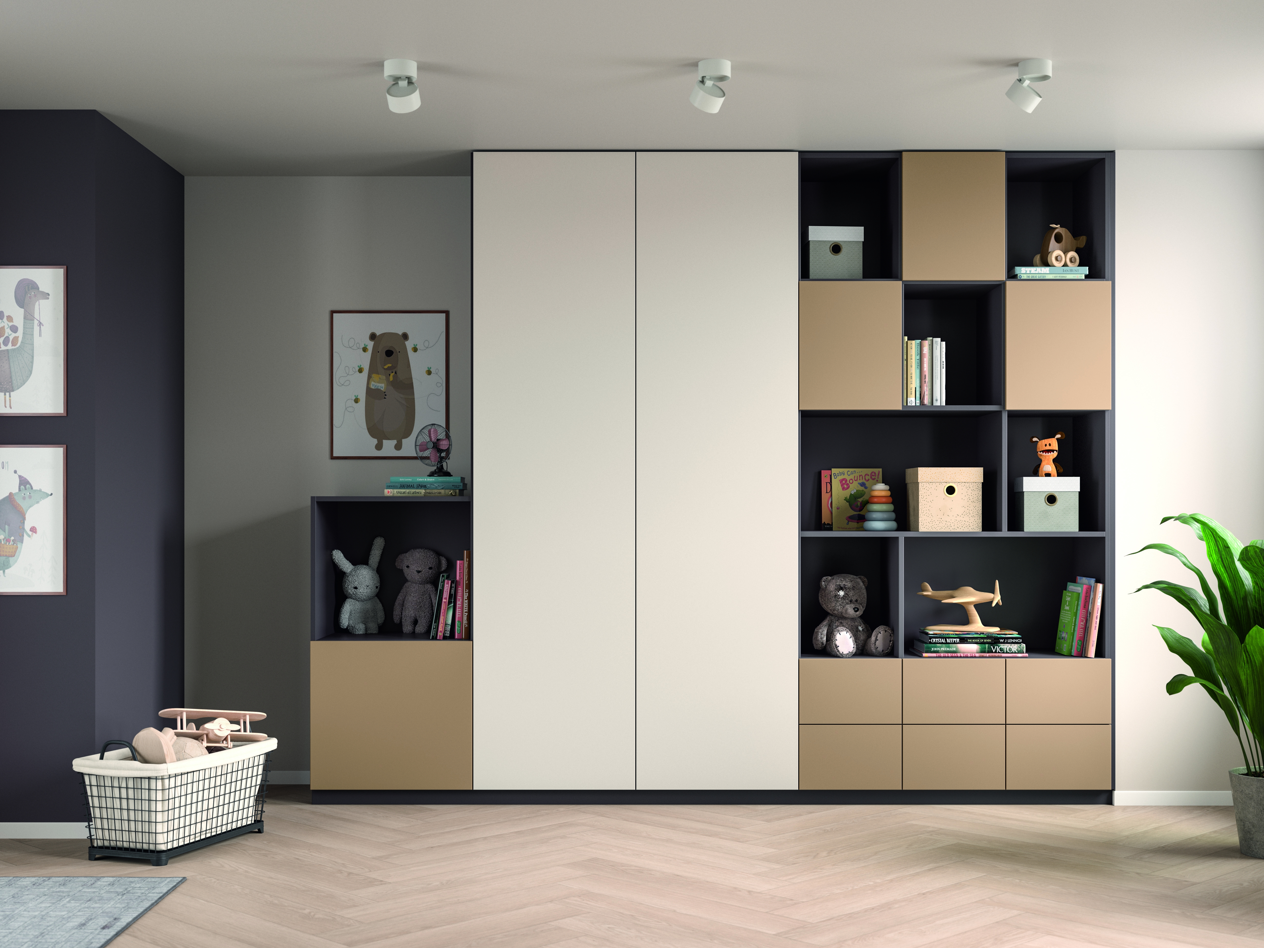
U250 ST9 Caramel Beige, U220 ST9 Soft Beige and U755 ST9 Havanna Grey
This desire for warmth is also influencing neutrals. Cooler greys, while still relevant, are being replaced by softer shades that carry depth and comfort. Havanna Grey reflects this beautifully, sitting between grey and brown to provide a natural, grounded alternative that aligns with the move towards warmer colour palettes.
Similarly, caramel and creamy beige tones are gaining popularity as consumers seek interiors that feel both luxurious and reassuring. U250 ST9 Caramel Beige captures this trend perfectly, offering an elegant yet comforting aesthetic that works effortlessly across a wide range of applications.
For those looking to make a stronger statement, darker colours are emerging. Deep, tones create a sense of luxury, particularly when paired with tactile, textured finishes. U398 TM Dark Berry and U590 TM Deep Blue represent this growing trend. Their rich colour depth brings sophistication and confidence, while their matt surface enhances their visual and sensory appeal. Deep Blue reflects the interest in blue tones seen throughout Milan, where they were paired with warm metallic accents and natural woodgrains to create contemporary interiors.
U250 ST9 Caramel Beige, U220 ST9 Soft Beige and U755 ST9 Havanna Grey
Painted finishes gain momentum
Another development is the popularity of painted timber. Long favoured within the UK, these finishes are now gaining traction internationally. The expansion of EGGER’s UK-exclusive Texture Meets Colour collection reflects this demand, with new shades including U645 Agave Green, U444 Cassis, U211 Almond Beige, U115 Carat Beige, U750 Taupe Grey and U590 Deep Blue offering affordable alternatives to traditional painted materials while retaining an authentic, premium appearance.
Ultimately, the return of colour is not about making interiors louder. Instead, it is about creating spaces with warmth, character and emotional connection. The most successful schemes are no longer driven by contrast, but by carefully layered tones that work together to build depth and atmosphere. As Milan demonstrated, colour has become an essential design tool once again, and its role in shaping the interiors of the future has never been more exciting.”
Whether you’re specifying, designing or manufacturing, EGGER and CPC have the products, expertise and support to help you deliver with confidence.
Ready to see what the partnership can do for your next project? Give CPC a call today:
028 8676 2685
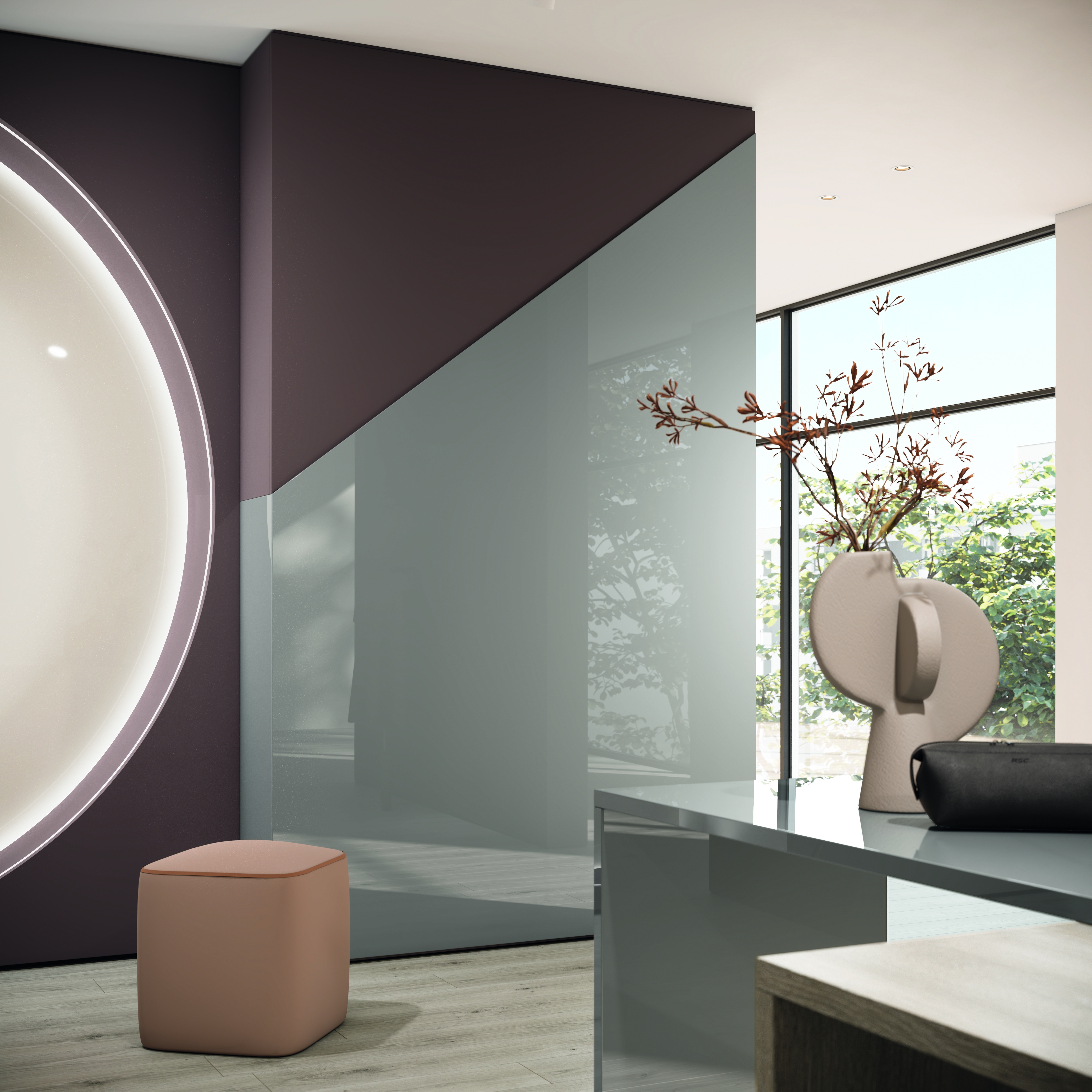
U398 TM_PM Dark Berry, U732 PG Dust Grey, H3146 ST19 Beige Grey Lorenzeo Oak